
Building a better e-commerce UX: Shift Bikes


Shift Bikes Company OVERVIEW
Company Context
A company sells bikes on their web experience. They need to enhance their browsing and checkout experience to greatly improve their product’s usability.
Business Goals
Improve the conversion from browse to completion of checkout to increase revenue on the product’s web experience.
Important Information from the Product Manager
50% of users open on average 7 item pages and then abandon the site without moving any items into the cart. The PM’s hypothesis is that users are unable to determine which bike is best based on relative features.
Additionally, 70% of users who place an item in the cart do not purchase. Data shows that users abandon the cart at the registration page. Right now, users must make an account to purchase. PM wants you to design a guest checkout to solve this. The guest checkout must capture email.
Roles & Responsibilities
My roles in this product included: UX design, UI design and some visual design. I conducted research, created wireframes, created a prototype and conducted usability testing.
Competitive Analysis
The first step of this project involved spending time with competitors’ products. Since the client wanted to improve their products usability, I studied three industry leaders. They are, Amazon, Target and Trek. The synthesis of my research can be seen in the embedded file.
Wireframes
The PM provided me with wireframes of the site’s existing structure. I kept these in mind for my design.
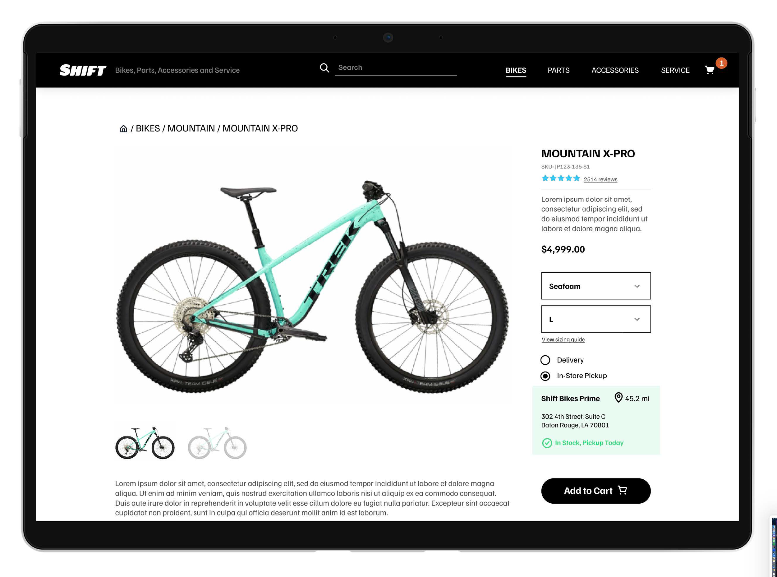
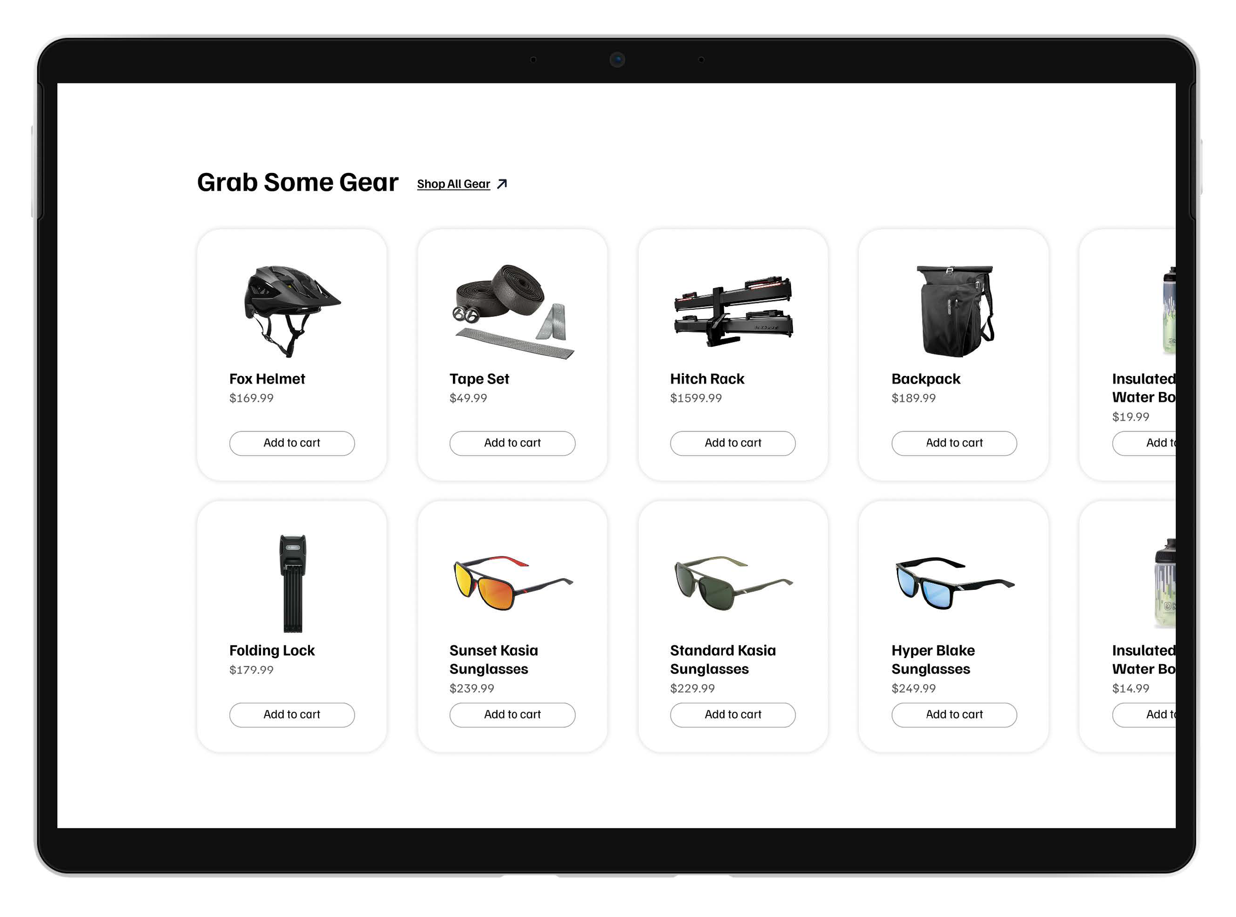
In order to engage customers, I greatly expanded the product page. I created an experience that goes through all features that a bike offers, while incorporating accessories and referencing other products throughout the page.
The initial checkout flow proved too be too simple during testing, so I expanded upon it in the next step.
Decide
After completing the wireframes, I did a round of usability testing. The testers were enthusiasts bike users who have disposable income to spend on bikes and accessories.
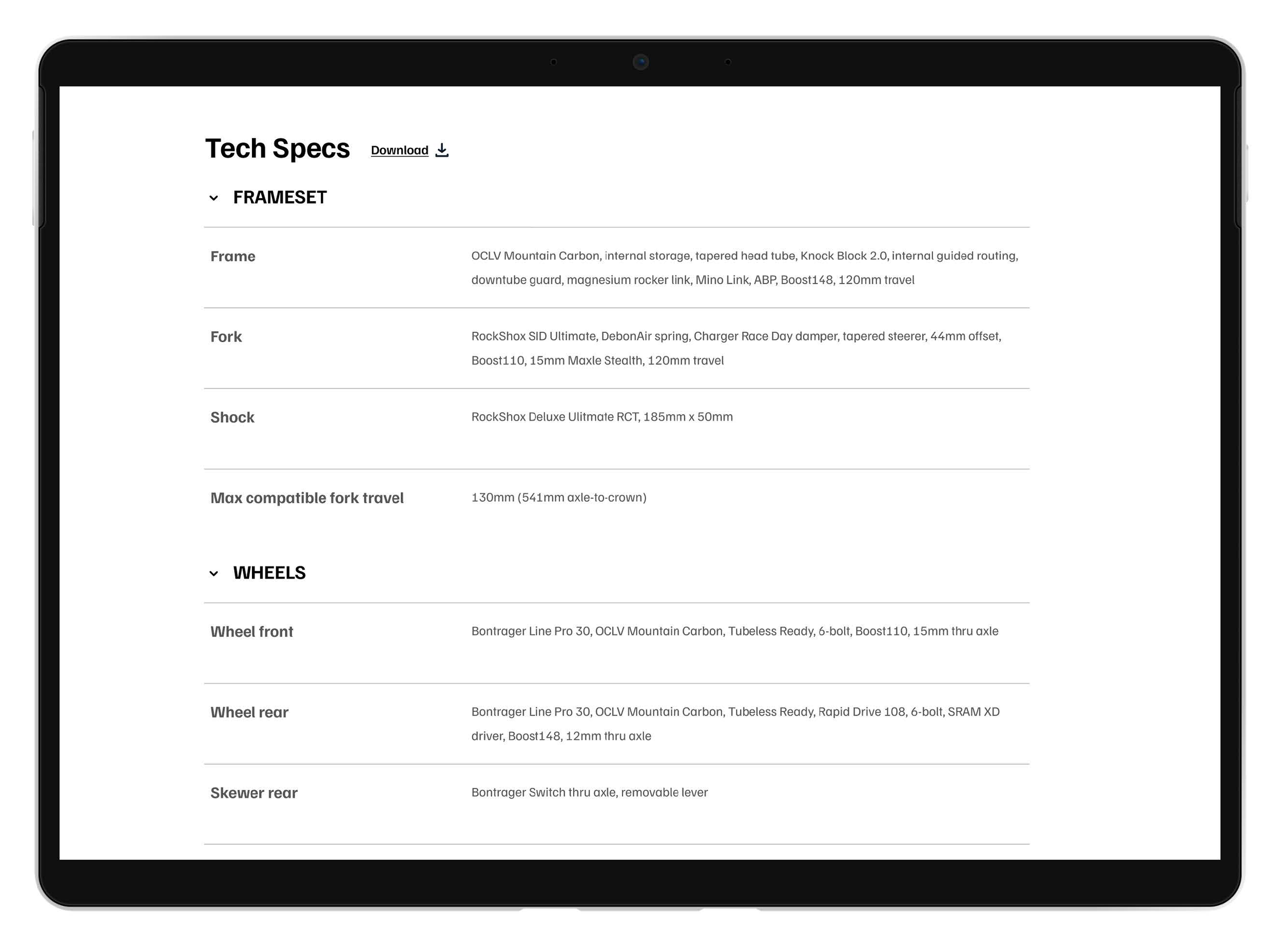
Most testers noted that they wanted more info on the product page. They want specific part details, details that only enthusiasts would know to look for.
At this stage of the process, that is plenty of useful information to iterate on in the next step of the process.
Prototype
For the prototype/design stage, I wanted a black/white look, which lends itself well to e-commerce and helps keep a design cohesive. E-commerce sites feature different products constantly, so going with a neutral color palette should cover any unpredictable product combinations.
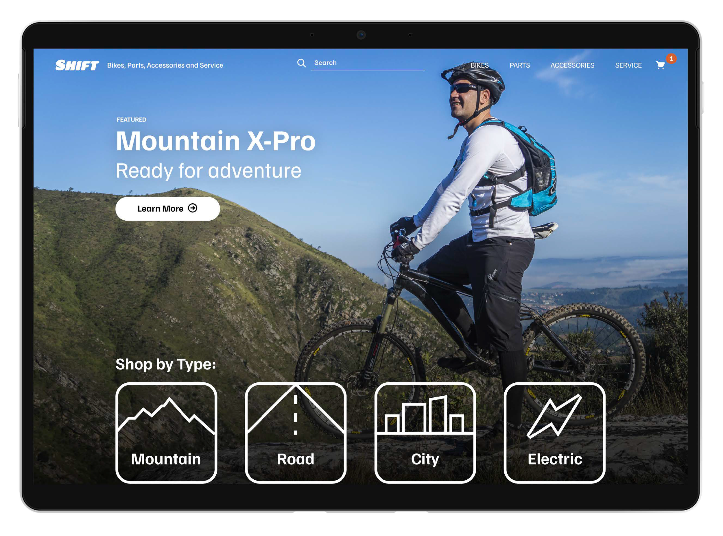
The home page shows a featured image. In this case, it is a featured bike. Next, you have four options to browse by bike type. Then you have the option to use the Bike Finder, in case the user is not sure what they are looking for. The Bike Finder is intended to keep the user engaged with the site instead of navigating away.
The product page is inspired by high-end magazine product spreads. The design is simple and clean, with big pictures and bold typography.