
Crafting a Command Center
How I designed an analytical stats-based dashboard for lacrosse coaches. This product will be used to track player progress, mentality and workout sessions.

Project Details
Company Overview:
Crease Pro provides personalized on and off the field training programs designed by leading professionals in the lacrosse industry.

Product Description:
Purpose: Dashboard for coaches to track player stats and progress weekly.
Use: Desktop or large screen devices.
Project Roles:
UX Design: Identified user needs and crafted intuitive user flows.
UI Design: Designed the visual elements for a user-friendly interface.
Usability Testing: Conducted tests to ensure a seamless user experience.
Methodology:
Design Sprint: Followed a structured approach over four weeks.
Collaboration:
Team: Collaborated with UX designers to create the Coaching Dashboard for desktop use.
Mentoring: Mentored junior designers to ensure a cohesive UI design throughout the Coaching Dashboard and Mobile App.
WEEK 1
Design Brief
During the first week at Crease Pro, I met with the team and other UX designers to discuss the upcoming project. As part of this meeting, I had the opportunity to ask pertinent questions to the company founders to clarify my role and responsibilities within the team.
Crease Pro informed us that they are in the process of developing an app tailored for lacrosse players and coaches. The app's key features will include personalized training programs, streaks, leaderboards, mentality check-ins and video uploading capabilities. Coaches will have access to monitor their players' progress and performance through the app.
My primary responsibilities will involve designing the UX for the coaching dashboard and managing the overall UI design across multiple screens, as well as overseeing typography and color schemes to ensure a cohesive and user-friendly design aesthetic.
WEEK 2
Research and Discovery
During the second week of the project, research and discovery were the key focus areas. Prior to this project, I had no prior experience with data visualization or adapting mobile screens to desktop experiences, presenting a significant challenge. To begin, I delved into researching the essential elements required for a comprehensive dashboard. This exploration unveiled that dashboards generally fall into two categories: Operational and Analytical. For this specific project, I determined that an Analytical dashboard would be most suitable. The decision was driven by the fundamental role of trends and strategy, digital reports and data analysis in the final outcome.
Further research was centered on understanding the hierarchy of information within the dashboard. Identifying the most critical information was crucial. This phase involved an in-depth exploration of dashboard hierarchy to ensure the effective organization of data and content.


WEEK 3
Preliminary Designs and User Testing
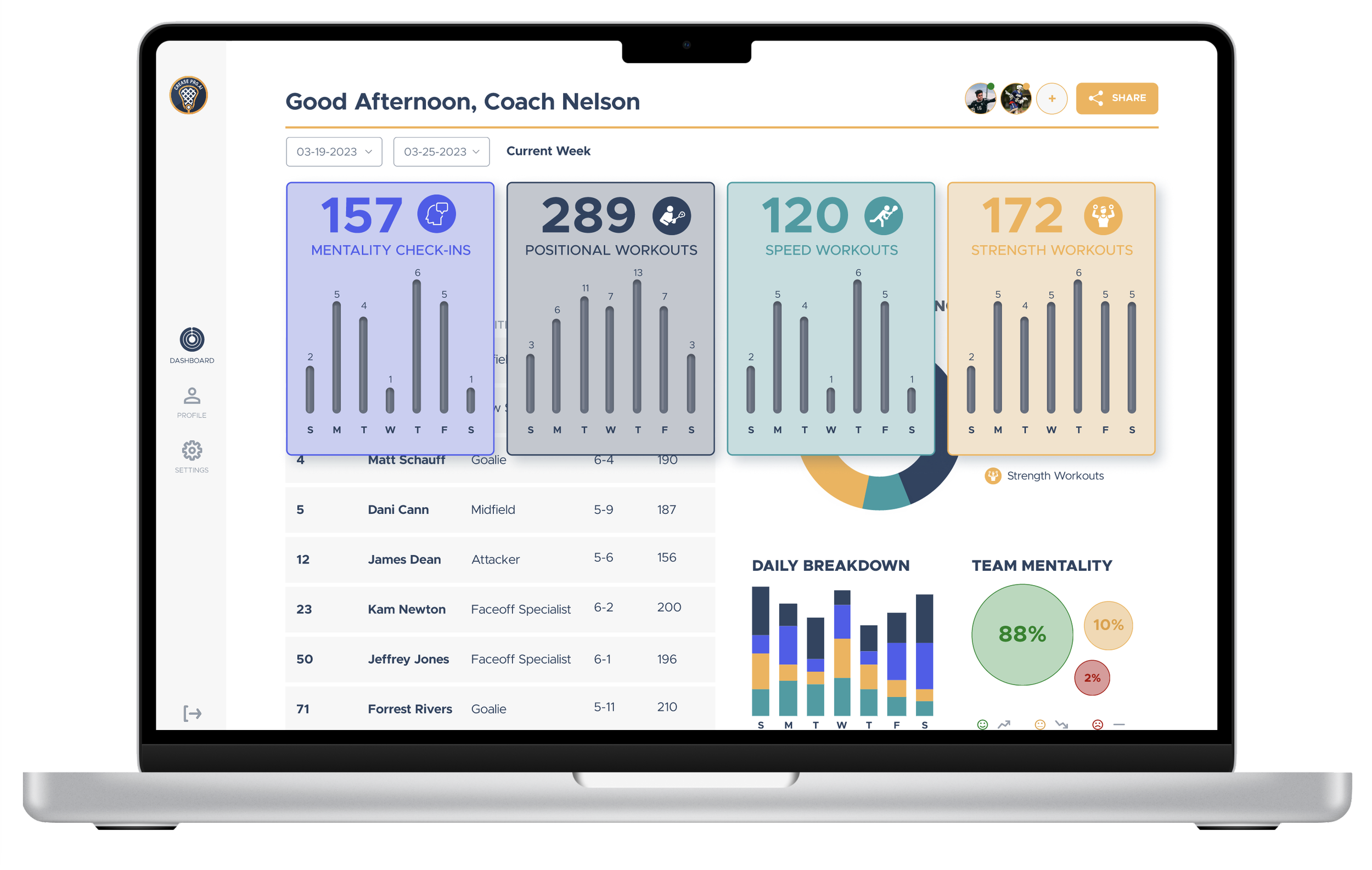
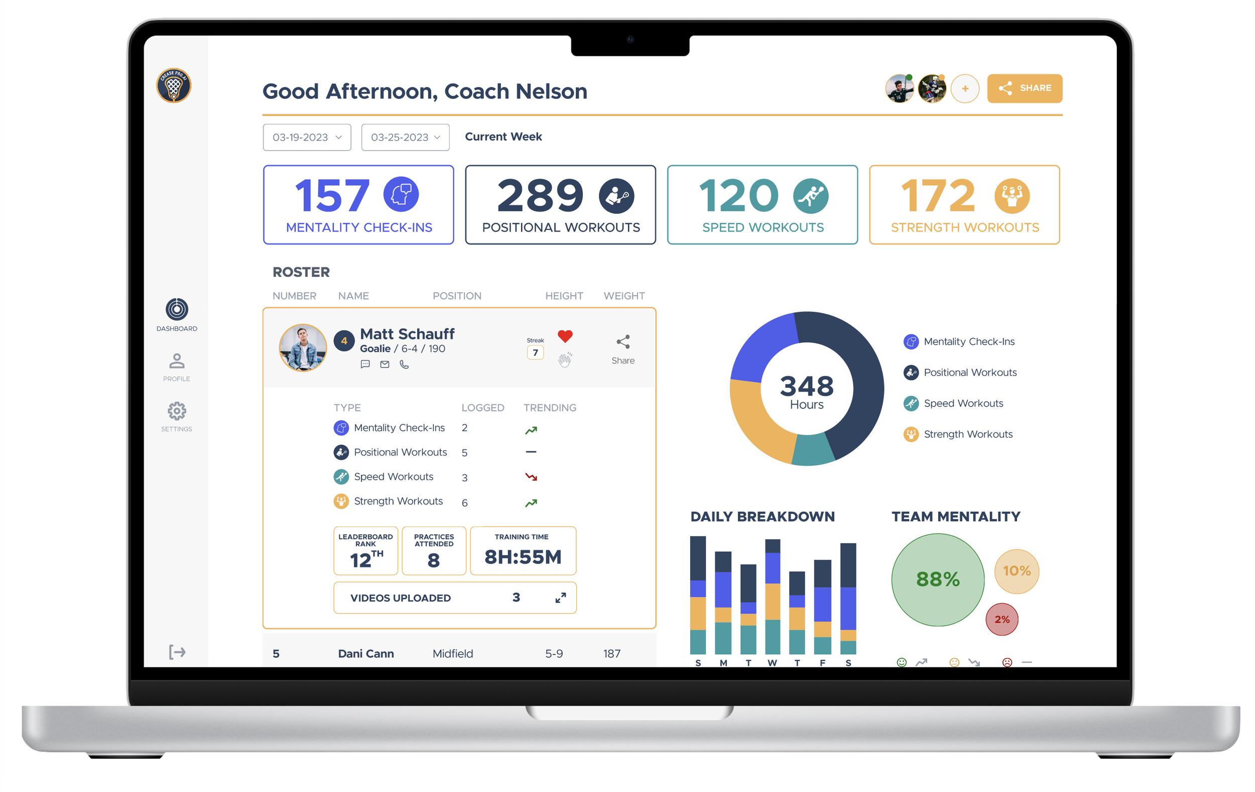
After conducting comprehensive research and analysis, the focus shifted towards formulating viable solutions. Initial feedback raised concerns about the visibility of various workout categories. An approach was devised to enhance distinction by assigning unique colors to each workout type, ensuring swift differentiation of icons and details. Subsequent feedback highlighted perceived neglect towards player statistics, deeming the presentation overwhelming. To address this, a player roster view was proposed, enabling coaches to access pertinent player information without feeling inundated by excess data.
Card Sorting Results:
Check-Ins
Positional
Speed
Strength
First design ready for user testing.
Design after incorporating user feedback.
WEEK 4
Feedback and Opportunities
Feedback Analysis:
Usability testing feedback revealed areas for improvement from coach insights.
Feedback Summary:
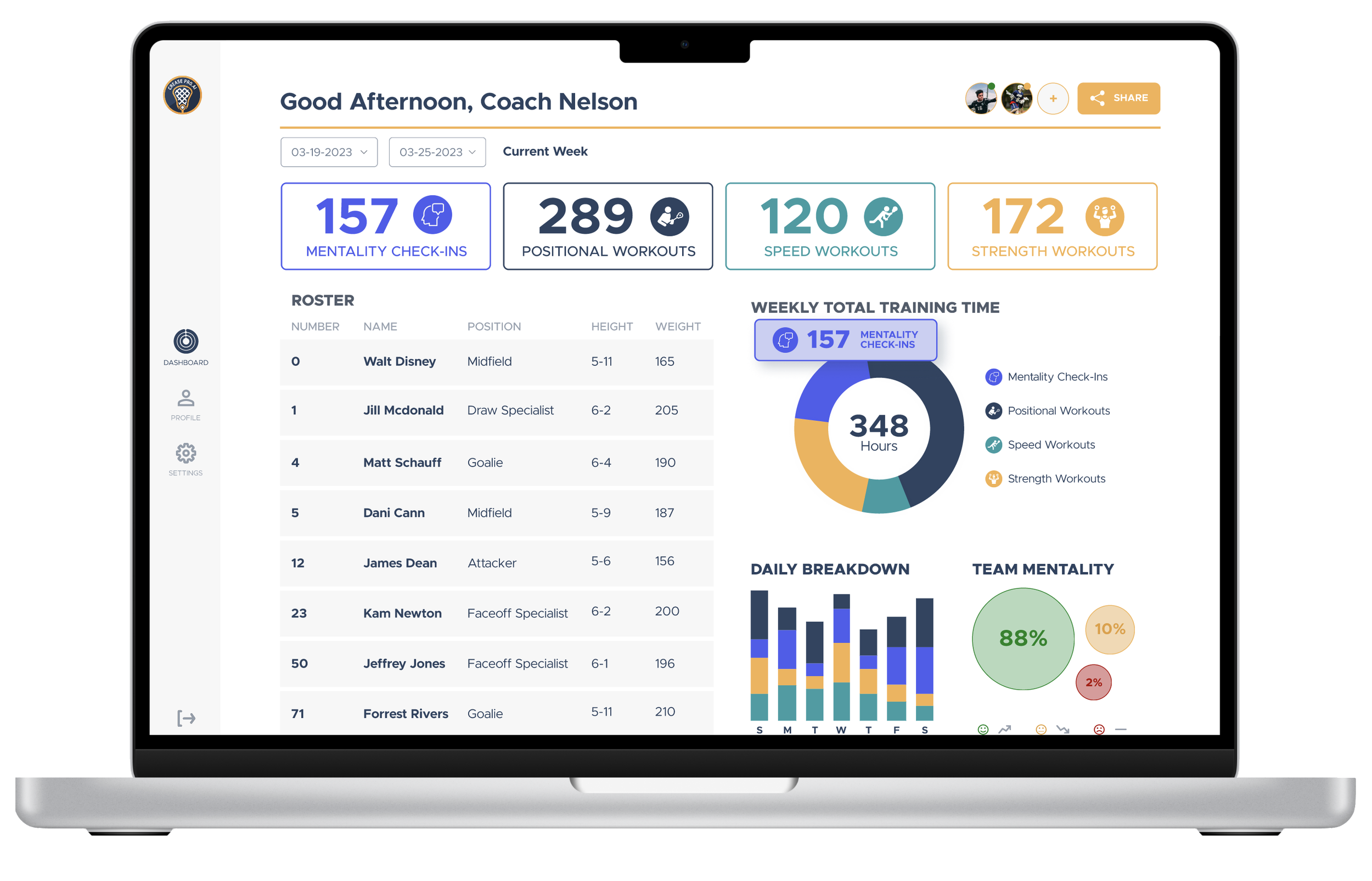
Leaderboard by Position:
Coaches expressed a need for a leaderboard categorized by player positions to better track performance and compare players within specific roles.
Video Upload Visibility:
There were questions regarding the visibility of videos uploaded by players on the platform. Coaches seek the ability to review these videos easily.
Player Profile Stats:
Feedback indicated a desire for more comprehensive player profile stats. Coaches suggested incorporating metrics such as check-ins, workout count, and tracking improvements over time.
Opportunities Identified:
Leaderboard Enhancement:
Implementing a position-based leaderboard and adding a feature to view player-uploaded videos would enhance the platform's functionality significantly.
Player Profile Augmentation:
Integrating additional stats like check-ins and workout numbers, along with an improvement metric over time, on the player details screen can enrich the user experience.

Design used for final round of testing, after incorporating stakeholder feedback.

Final designed submitted to Crease Pro.


What I Learned
//
What I Learned //
I learned the value of user feedback in enhancing design through changes implemented after usability testing, resulting in a user-friendly dashboard.
Ensuring that the final product meets the specific requirements and preferences of users significantly enhanced its overall quality and functionality.
Completing the project on time, despite limited knowledge, highlighted the significance of flexibility and persistence in design.
The successful prototype underscores that acknowledging user input leads to positive outcomes.